Favourite music genre
Friday, 18 March 2011
Friday, 11 March 2011
Final Version Before Improvements: Front Cover
This is my FINAL front cover
The image is the same as version three, I think its the best image to use as it has strong eye contact with the audience. The only adjustment I have done to this from version three is made the St. Sunflower stand out more and lined up all my strap lines and made the bar code smaller.
Thursday, 10 March 2011
Double Page spread - Version three
Here is version three of my double page spread
I haven't changed much on this version only the font colour of the intro paragraph to a light red.
Double Page Spread - Version Two
Here is version two of my double page spread
The image on this version works a lot better than the first one, I think it shows the artist attitude more and gives more presence to the page. I also prefer the St.Sunflower head mast more, I think it matches the magazine and stand out more than version one. I like the layout of the double page spread, I think its logically and not too cramped. I also inserted a quote from the interview to make it look professional. The only thing wrong is the font colour of the intro paragraph, it doesn't stand out enough.
Double Page Spread - Version One
Here is Version one of my double page spread.
I'm not keen on the image, its out of focus and I don't think it stands out to the audience enough, also I havent edited enough to get rid of colour except the yellow flower, I also don't like the colour of St.Sunflower I don't think it matches well with the magazine. I like the layout of the page and the placement of the text. I need to change my image and the head mast.
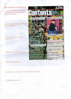
Contents Page - Version Three
Here is my contents page version three
I havent changed much on version three only the image. I dont think the image is as affective, the picture is slightly out of focus so it doesnt stand out fully. I prefer Contents page version two.
Friday, 4 March 2011
Contents Page- Version two
Here is my contents page version Two
This is a lot better than version two, I used the same title though as I think it stands out and looks professional, theirs more page listings, more colour and a better layout. My image is an image of the artist on the double page spread, Im still not quite sure on this image as I think it clashes against the background.
Subscribe to:
Comments (Atom)


